The NWSL season begins March 19. Players report to their teams on February 1. Before all the on-field action of the Challenge Cup begins, there’s an important matter to attend to. While jerseys, rosters and coaching positions are still wide open throughout the 12-team league, there’s one way they can all complete – through their logos. Beyond Women’s Sports is here to do the difficult job of determining the NWSL logo ranking.
We asked the staff of BWS, regardless of which sport they cover, to share their insight into the top and bottom tiers of NWSL logos. Below is the definitive ranking of NWSL logos, with some additional commentary from Tim Antoniewicz and Thomas Costello of the BWS soccer staff.
Starting from 12th, going all the way to 1st, here are the top NWSL logos.
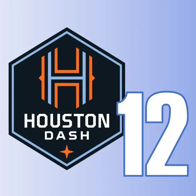
12 – Houston Dash
Tim – The Houston Dash’s logo is lackluster on its own but designed to be part of a whole with the men’s team and youth teams, looks a bit like a baseball logo but unique shape stands out, the Dash love the orange color and this should’ve been used more.
Thomas – Definitely lacking the orange that’s synonymous with Houston soccer. While it’s supposed to work alongside the Houston Dynamo’s logo, from men’s Major League Soccer, a logo should also stand alone. Alone, Houston’s logo doesn’t cut it.
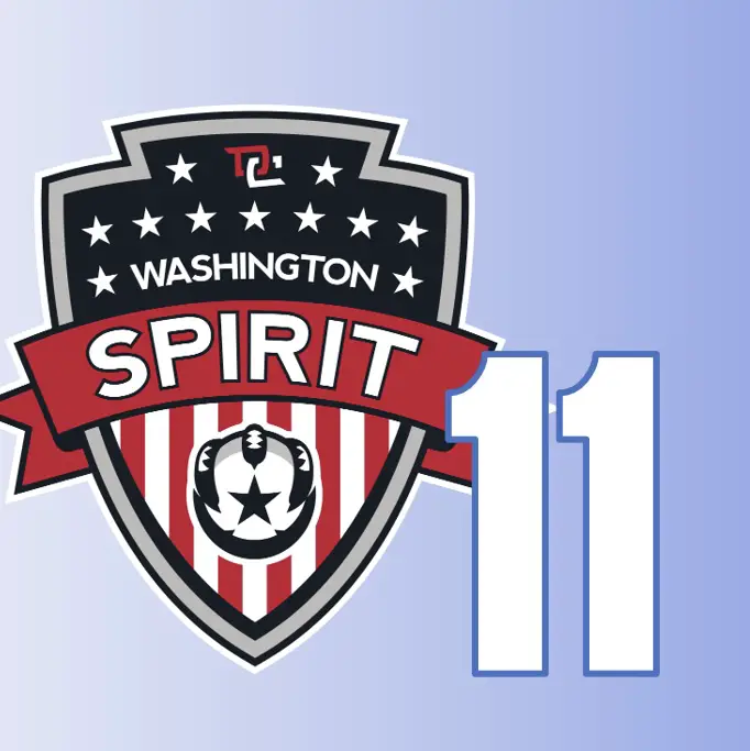
11 – Washington Spirit
Thomas – Washington Spirit’s logo is the exact opposite of Houston’s. This time, it’s doing too much. Connecting to Washington D.C. is great, but combining stars, stripes, a big ribbon and and eagle (maybe a velociraptor) holding a ball with a star on it? There’s a lot going on here.
Tim – Washington’s logo is looks very outdated, definitely needs a refresh but not necessarily a complete re-do. It’s a bit too cartoon-ish but at least immediately identifies as Washington DC and not Washington state.
10 – Orlando Pride
Thomas – The Orlando Pride logo is fine. A nice circle logo is visually appealing, but I agree on the fountain. Some think it’s the fountain of youth, but it’s definitely just a local fountain. When I think of Orlando, I don’t think of fountains, but there may be copyright issues with what I associate with the city.
Tim – It seems like it was quickly rushed together without a lot of thought. Their fountain is a part of the city, but Orlando has a huge non-local fanbase that does not understand or identify with it. Probably the logo in most need of a complete re-do
9 – North Carolina Courage
Tim – NC’s logo is overall underrated. It tends to get more negative attention due to being a lesser liked club but it’s not a lesser logo. I think it has an interesting and unique play with positive and negative space, gold accent/color unique to team and representative of winning culture. Also, the non-traditional lion is cool.
Thomas – I had no idea that was a lion. I’ve been to a match in Cary, NC and I don’t recall anything lion-related elsewhere on the team or in the stands. This one, like Houston’s, matches well with the men’s team sharing the same ownership. Carolina’s logo is different, but not in necessarily a bad way.
8 – OL Reign
Tim – The problem with OL Reign’s logo isn’t what it is but what it isn’t. The previous Seattle Reign logo was much better and exuded a feeling of power. OL Reign’s current logo feels European which makes sense based on ownership but isn’t what the fanbase wants. Also, why is the lion eating a Pringle?
Thomas – All I can see now is the lion eating a Pringle. Thanks a lot, Tim. I forget everything I wanted to say about this logo because now I just want some chips.
7 – Chicago Red Stars
Thomas – When I look at the whole lot of NWSL logos, I put them into categories with each other. I put the Spirit and Red Stars logos in the same category. There’s a good bit happening in the logo, but Chicago’s logo does everything Washington’s logo is trying to do.
Tim – Classic shield shape with design that is iconic to the city based on the city flag. Chicago’s logo will never be too outdated nor look too modern. It’s overall underrated because it isn’t flashy but captures the spirit of the city just like the team.
6 – Racing Louisville FC
Tim – Louisville’s includes unique colors but does not include the mint green. It does have cool rotational symmetry and design with the Fleur de lis means something to the people from Louisville. It’s a bit too similar on a foundational level to the Thorns logo though.
Thomas – There are definitely big Thorns vibes on Louisville’s logo, but the simplicity works. This logo seemed to usher in simpler logos into the NWSL. It’s one logo and letters. It will stand up against the test of time, and is way better than Proof FC.
5 – Kansas City Current
Thomas – I really dig this logo. The red line representing the state border and the river that cuts throughout the city. Something about the color scheme of red and teal really works. This will look good on their training center and new stadium. Also, only Rome, Italy has more fountains in a city than Kansas City. Maybe they should have stolen from Orlando?
Tim – KC has a unique color combination and overall appealing logo. Unfortunately, it’s a bit cartoon-ish. The logo captures the name of the team but may not capture the essence of the city. It’s also confusing that two stars represent two states and not the city’s two NWSL championships with FC Kansas City.
4 – San Diego Wave FC
Thomas – When San Diego unveiled their logo, I was amazed. So much so that I said I’d wait a couple days to see if I still thought the same. It’s now been a couple weeks and my view hasn’t changed. This logo represents the city perfectly, and the hidden FC in the wave is a nice touch. So often, American teams try to copy European logos, but this one is uniquely San Diego. Although, I can see why this is one of the more polarizing logos in the league, taste-wise.
Tim – SD has a cool design with the sunset fitting below the crest of the wave. It’s clearly well thought out. Unfortunately, it’s perhaps a bit over-stimulating with many different bright colors, maybe won’t look as universally cool on all street gear such as Gotham. Also, was it sponsored by Lisa Frank from the 90s?
3 – Portland Thorns
Tim – Portland has an interesting and intricate design. Like Racing, it’s got cool rotational symmetry and it’s not too flashy nor too simple. Also, is the flower in the middle is supposed to be a rose? This logo falls short, to me.
Thomas – It seems odd to place this one up higher than Louisville, when they have many things in common. This logo was popular with a lot of folks in BWS. I can see why. It will also hold the test of time and the red and black color scheme of Portland is great. I also love that it doesn’t just jump into whatever the MLS team, the Portland Timbers, are doing. Each team stays mostly unique, which is why it’s higher up the list for me.
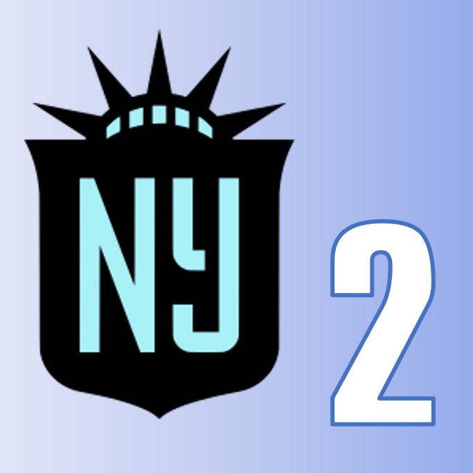
2 – NJ/NY Gotham FC
Thomas – Anytime a logo can remind me of Ghostbusters 2, I’m for it. The Gotham logo may be the most simple logo in the bunch, think complete opposite of Washington. The black and teal color scheme could fade over time in popularity, but Gotham’s logo is a world beater compared to the old Sky Blue FC logo. A+ rebrand and deserving of second on the top list of logos.
Tim – Exactly, it was an incredible rebrand. Gotham’s logo is simple yet eye-catching and unites a divided fanbase. I think it’s overall stunning. The crown feature reminds fans worldwide immediately of statue of liberty and therefore USA as a whole.
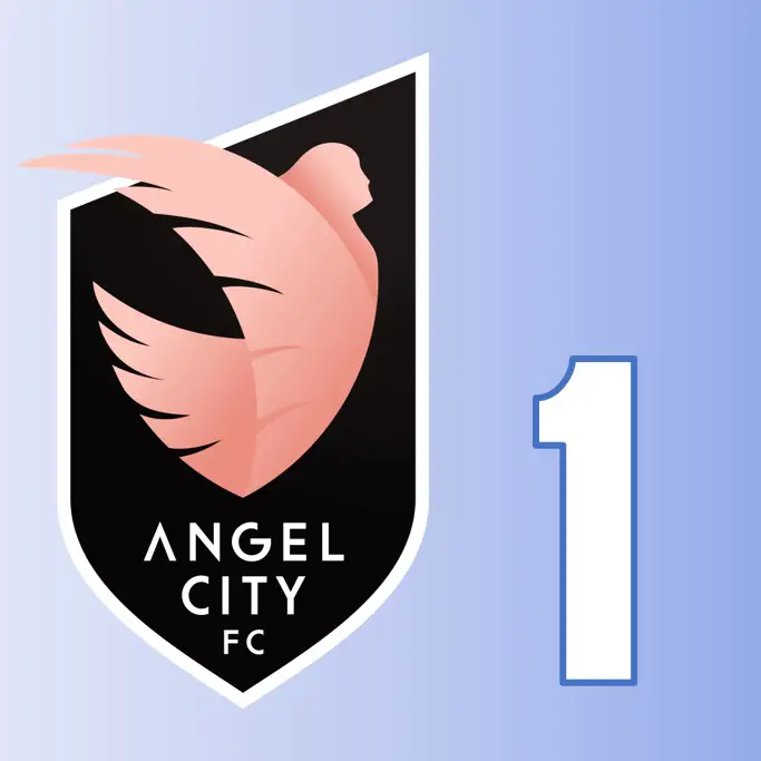
1 – Angel City FC
Thomas – When the BWS staff was asked about their favorite and least favorite logos, Angel City’s was the lone example of a logo in just about everyone’s top 3. Alongside Gotham and San Diego, Angel City’s logo ushers in a new era of branding for the NWSL. The angel is great, and the oddly shaped crest and broken up font just works together. It’s not better than San Diego, in my book, but definitely see why it’s number one. Tim might have been the only person that didn’t have Angel City in their top 3…
Tim – Angel City’s logo is simple and has a modern look. Including an asymmetrical look and including unique colors makes the logo interesting. Too me though, it will never be the best or the worst logo of the bunch.
You’ve seen the NWSL logo ranking from Beyond Women’s Sports. Now it’s your turn. Let us know in the comments below where we got things right or wrong. You can share your thoughts on our Twitter page too. Follow us @BeyondWSports.

